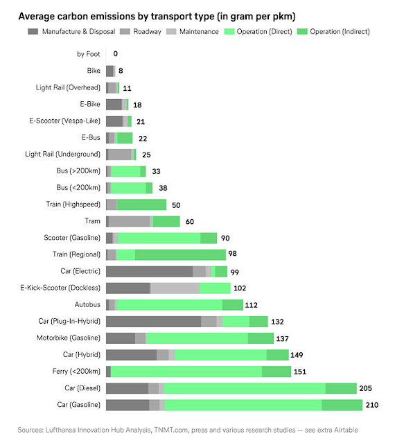
Ranking carbon emissions of urban transport modes
The chart above shows the relative greenhouse gas emissions for various transportation vehicles. TNMT, a data analysis group of the Lufthansa Innovation Hub aggregates data for the chart with the caveat that the numbers are not exact (for example, cars vary greatly in their gasoline consumption, but an average can be approximated). Emissions are often not obvious; for instance, a vehicle may have low emissions while driven, but the manufacturing of it may produce a lot. The chart is useful for making individual decisions as to vehicle choices or frequency of vehicle use. It shows that we can make big reductions in our carbon footprints if we are deliberate in our use of travel technologies. If we choose to use one for short errands and another for long-distance travel, that will be significantly beneficial. — Steve Price


